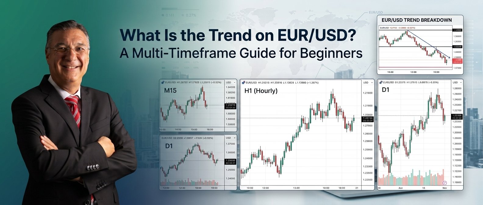
I get this one in almost every seminar I run. Someone puts their hand up and asks, almost word for word: “Andreas, what’s the trend on EUR/USD?”
My honest answer never changes. It could be up. It could be down. It could be sideways. Take your pick, really, because if you haven’t told me the timeframe, the question doesn’t have one right answer.
That usually gets me a few raised eyebrows. People want the confident, one-line answer. “It’s bullish.” “It’s bearish.” But if you go back to the basics of technical analysis, a market can genuinely be going up on one timeframe, down on another, and sideways on a third, all at once, on the same exact pair.
I’m not saying that to be clever or dodge the question. It’s one of the oldest principles we have in this business, and honestly, it’s a big reason so many traders get chopped up in the markets without ever understanding why.
Table of contents
Why “What’s the Trend” Is Really Three Questions
When someone asks “what’s the trend on EUR/USD,” what they’re actually asking, even if they don’t realize it, is “what’s the trend on the chart I’ve got open right now?” That’s the real issue. Most retail traders only look at one chart, one timeframe, and just assume that’s “the” trend. Full stop.
Zoom out to the weekly, and you might see a clean uptrend that’s been running for months. Drop down to the 4-hour, and that same pair could be sitting in a corrective pullback. Drop down again to the 15-minute, and the price might just be chopping sideways, going nowhere.
All three are true at the same time. None of them cancels out the others. They’re just showing you different layers of the same market, and if you’re only looking at one layer, you’re only seeing a small slice of what’s really going on.
Dow Theory Explained: Why Markets Move in Three Trends at Once
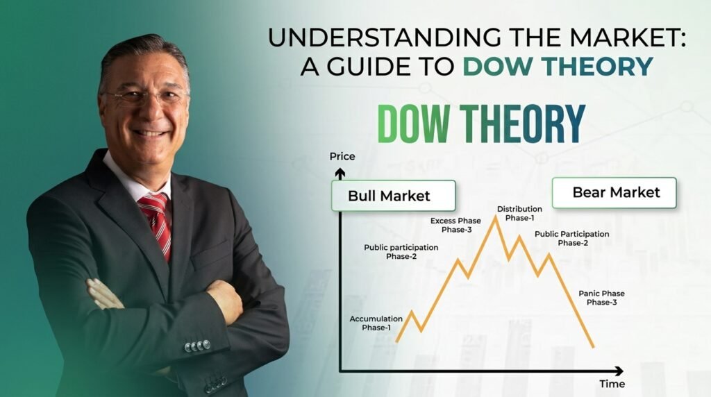
This isn’t a new idea, by the way. It goes all the way back to Charles Dow, one of the founding fathers of technical analysis. Dow Theory talks about three trends running at the same time, and the way it’s usually explained is through the tide, the waves, and the ripples of the sea.
The primary trend is the tide, the big direction that can last months or years. The secondary trend is the wave, the pullback or counter-move inside that bigger trend, usually weeks to a few months. And the minor trend is the ripple, the short, noisy day-to-day movement that can flip in days or even hours.
Think of a swimmer caught in a ripple. It feels like they’re being dragged out to sea, even though the actual tide underneath is pulling everything toward shore the whole time. That’s the trap. You see the ripple, you panic, and you completely misjudge where the water’s really taking you. Same thing happens in trading. A normal pullback gets mistaken for a full reversal, and that one misread can wreck your whole position.
Elliott Wave Degrees: Trends Within Trends
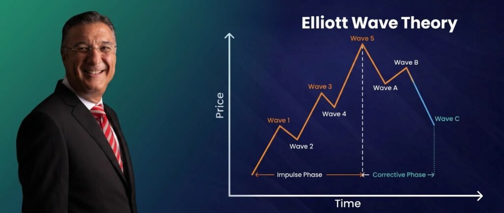
Years later, Ralph Nelson Elliott built on the same idea with his Wave Theory, and he took it much further. Elliott said markets move in repeating wave patterns, and these patterns happen at the same time across different “degrees,” from the Grand Supercycle that stretches across decades, all the way down to tiny sub-minuette waves that finish in minutes.
What looks like one clean impulsive wave on a monthly chart might, when you zoom in, actually be made up of five smaller waves, each with its own trend and correction inside it. Trends within trends within trends. Almost fractal, where the same shapes keep showing up no matter how far in or out you zoom.
You don’t need to follow Elliott to the letter to take the lesson from it: structure depends entirely on the timeframe you’re looking at. It’s never one fixed thing.
How Multi-Timeframe Analysis Changes Your Trading Plan
This isn’t just theory for theory’s sake. It changes how you should be building your trading plan.
If you swing trade, holding positions for days or weeks, the 15-minute “trend” is basically noise to you, the ripple, not the tide. But if you scalp, in and out within the hour, that same 15-minute structure might be exactly what matters, and the weekly trend is just background.
The mistake I see again and again with students, before they go through proper training, is mixing timeframes without even noticing. Taking an entry off a 5-minute chart and then unconsciously expecting it to act like a multi-week trend. That mismatch is where most “the market did the opposite of what I expected” stories actually come from. Nine times out of ten, the analysis wasn’t wrong. The timeframe was just never defined in the first place.
The Real Question to Ask Yourself
So next time you catch yourself asking “what’s the trend,” stop and ask a better question first. What’s my trading timeframe, and what does the trend actually look like there, plus on the timeframe one level above it for context?
Define your timeframe before you define your trend. Do that consistently and the market stops looking confusing and contradictory. It just starts looking like what it actually is, a structure that repeats across scales, and one that finally makes sense.
If you want a structured, step-by-step way to read trend, structure, and Fibonacci levels together across timeframes, that’s exactly what we work through inside the Technical Analysis Bootcamp.